Flowear influencer packaging collaboration showing Yashma Gill presenting a black-and-pink box, opening the package, showing printed inserts and handling the garment in a bathroom setting.
Flowear Mother's Day gift reel showing a black-and-pink branded box and other gift items inside a woven basket tied with pink ribbon. The campaign overlay announces a Mother's Day sale and discount code.
The challenge
A personal subject. An open conversation.
Help period underwear find an approachable voice in Pakistan.
period underwear adoption
New category
discussing it publicly
Personal subject
the market context
Pakistan
The approach
A connected system. Every part has a job.
01
Give it a voice
We built the identity, packaging and tone of voice to make a personal subject approachable.
02
Start with education
We led with education, making a personal subject easier to understand.
03
Bring people in
We partnered with creators to show the box and talk about it openly.
04
Connect the system
One identity runs through the box, the feed and every collaboration.
The system, expressed
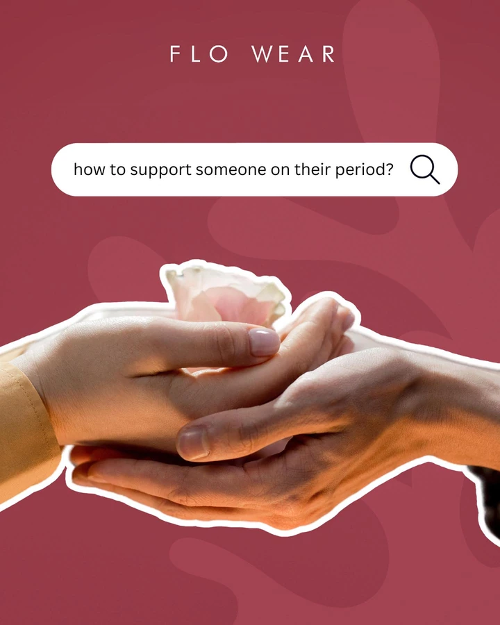
Two complete education slides connect the period-care subject with the brand’s visual language.
Identity → education → packaging → influence
The brand, broken down
Bold colour. An approachable voice.
Pink runs from the emblem to the inserts to the feed, and dark packaging makes it pop. Education and creator content were designed to make a private subject easier to discuss.
Burgundy
Pink
Black
The Flowear colour world.
01 / Typography
Direct, expressive, readable
Big, emphatic lettering for education posts, with quieter product copy on the box and inserts.
02 / Marks & applications
A mark that travels with the box
We put the emblem and name on a black box, with pink printed inserts carrying the brand inside.
From the education and packaging work
Packaging / Product / Detail
Before the first use. A brand experience.
Full identity and packaging, brought together in the actual unboxing. The outer box, emblem and printed inserts carry the same recognisable visual language.
The box makes an entrance
The black box carries the pink emblem and name. A printed pink insert continues the same visual language.
The identity continues inside
The packaging film reveals the product, liner and printed inserts inside the actual box.
Frames from the selected packaging-collaboration film. Product statements shown or spoken belong to the brand; this case documents the creative work.
Your brand, next
Let’s find your momentum.
Connect your brand, content and customer journey with a plan built around your business.